BACKGROUND
Sanford Summer Enrichment is a program designed to keep students engaged in their academic studies, while also preventing knowledge-slip through the summer months.
A reoccurring challenge is the notion of this program being thought of as typical summer school. Though enrollment into the program is traditionally high, I was challenged in creating a visual campaign and brand design that would entice students into enrolling into the program.


DESIGN SOLUTION
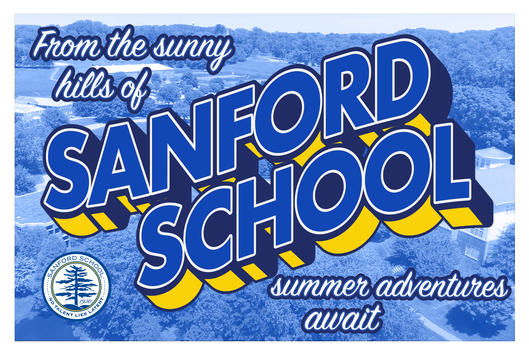
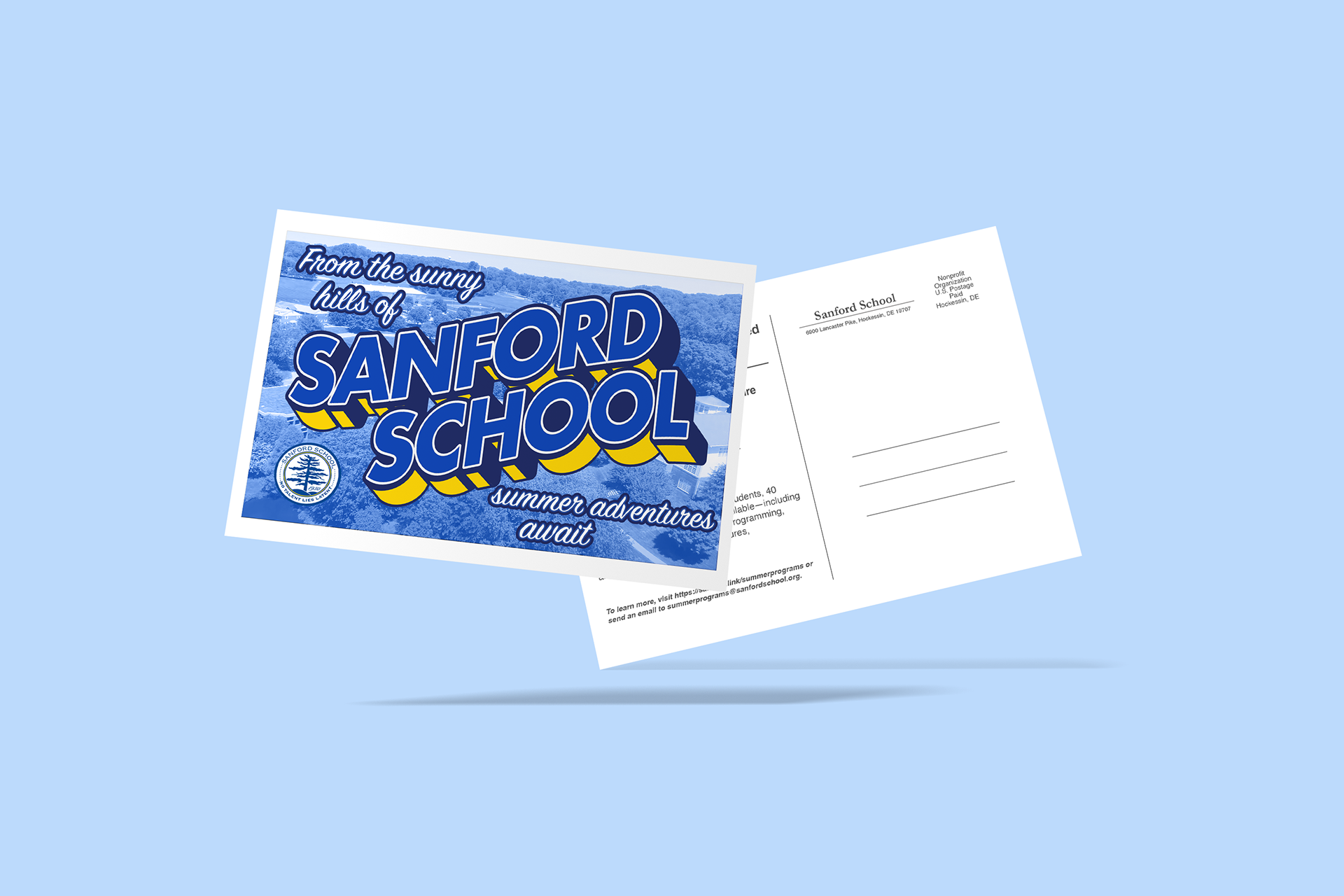
Inspired by German printer Curt Tech's "Greetings From" post cards, the visual design of the program aimed to communicate this program as being a joyous vacation, rather than a mundane commitment. Featuring the characteristic 3D block letters, along with the handwritten font, this visual language strives to communicate both the since of summer fun in addition to the since of heritage that comes along with "Greetings From" postcards.

Secondary combination mark, used as stamp for still images


